Foundry Assignments

At EVERFI, I came onboard to research and design a next generation edtech platform that could handle a variety of use cases in different verticals. This case study covers the assignment UX for the Foundry project, an edtech platform used to assign harassment training at companies (among other uses).

This case study covers just the Assignment subsystem, which was essential for Higher Education and Corporate Compliance. In legacy systems, each learner assigned a course (such as anti-harassment training) was tracked separately and there was no way to manage these at an aggregate level. My research showed that most assignments were made in large batches, such as thousands of entering students at a college or hundreds of new hires all assigned in monthly batches. This research involved SQL and Python and yielded a number of insights that had never been seen before in the company's history.

I was involved for over two years, from early brainstorming to migration and onboarding for hundreds of customers.

  • Role: Research & Design
  • Client: EVERFI
  • Tools: Sketch, Invision, Axure, Interviews, user testing
  • Duration: 2 years
  • Year: 2018-2019
Early Design

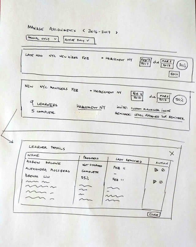
This sketch introduces the idea of a list of all assignments, binned by year and filtered by a couple of terms. Each item on the list represents an "assignment" from the assigners point of view, not from the learner's. I pushed for us to use cards, rather than the enterprise UX default of tables, because there is too much information and I wanted the admin users seeing this to relate to batch assignments as primary objects, with individual learner's progress on an assignment just a detail.

Assignment Management

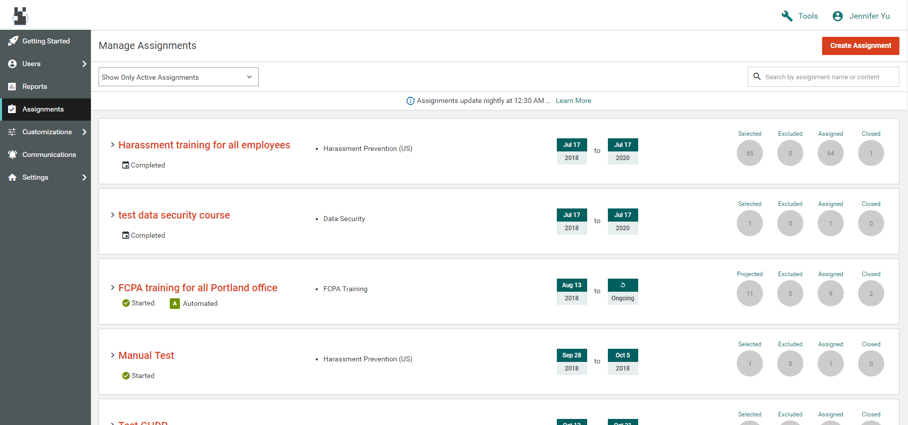
We ended up with this assignment management screen, which looks pretty good. However, it was a constant battle trying to keep this page trim and clean as new user problems triggered quick fixes that bloated the page. Here you can see a quick fix for the question of "what time does an assignment go out." This fix came from product management and never went through design.

Quick vs Auto

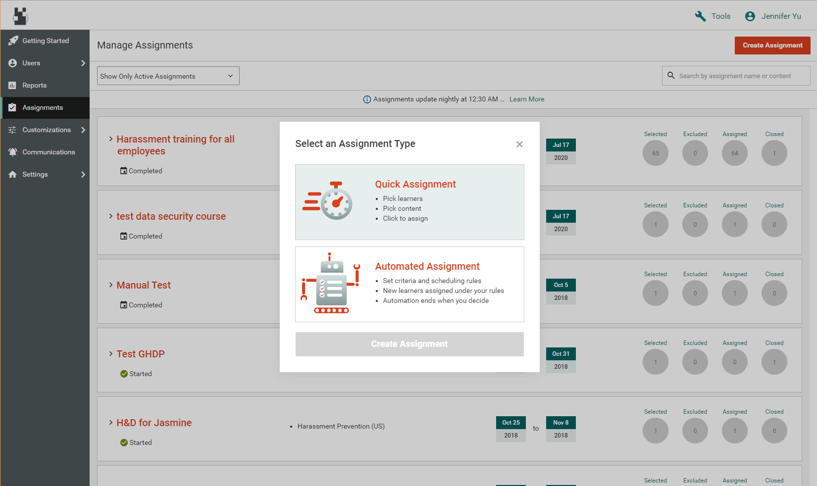
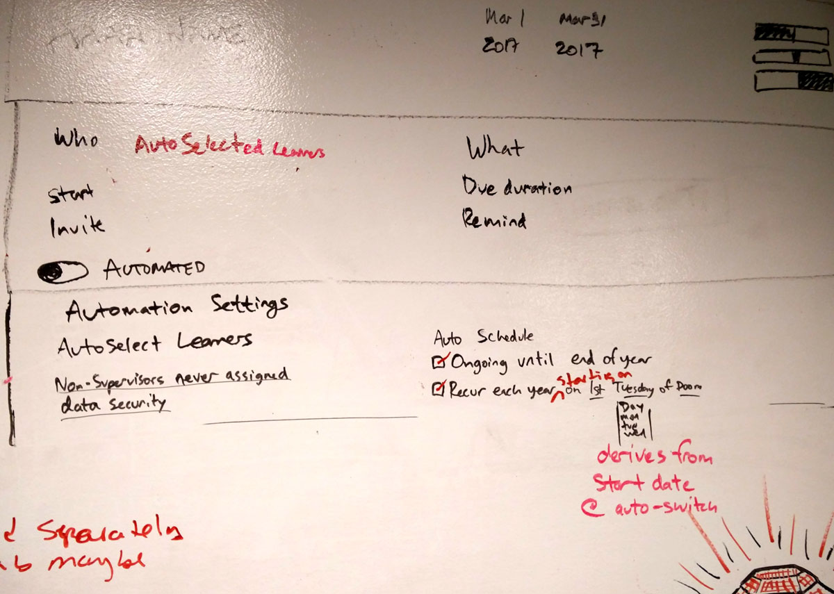
For creating new assignments, we designed this interstitial clarifying the manual assignment vs automated assignment. Automation was a major new feature of the platform and critical to calling it a success and migrating customers.

Assignment Creation

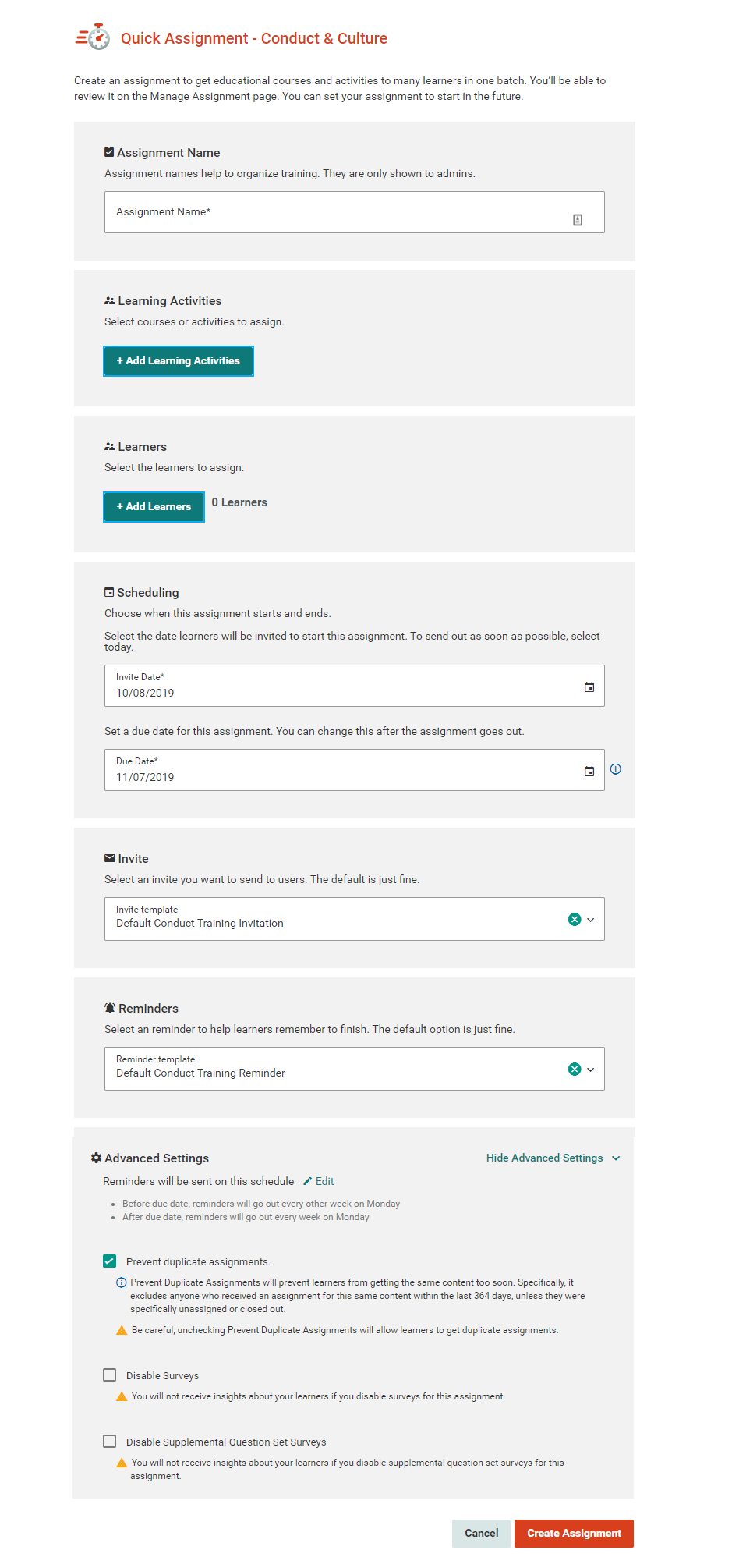
The assignment creation form represented a major improvement from the legacy platforms and included several critical options under "Advanced Features." We also tried to make up for its length by providing strong defaults, as my research had shown most users had no problem with the default invitation, start date, or reminders.

New Automations To establish value for the new platform, we absolutely had to establish a new and powerful feature. Our PM chose automated assignments and we considered many ways to implement this to best serve our main use cases. Here is an early whiteboard concept about automation scheduling. The particular issue addressed here is how to offer the option to "run a batch job every day to assign eligible learners" versus "run a batch job once a year that includes everyone who is eligible on that day."
Select by Filter 
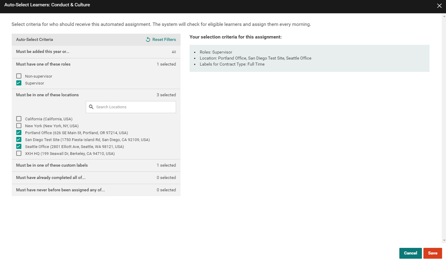
Here was our approach to automated learner selection. Although we had initially designed a condition builder, building it would require too many hours from engineering and we ended up iterating on the normal filter bar design to create this two panel design. Select criteria on the left and see a narrative description of the sum of your filters on the right.
Distinct Data View

Ultimately, admin users need to know how many people have actually done the training they were assigned! I worked closely with the data team to calibrate and simplify this report to translate from various backend concepts to a report customers could use without trouble.