The company's first product-led growth motion centered around an AI-powered scanned that analyzes SOC 2 reports.
The SOC 2 cybersecurity standard results in a technical report, refreshed annually, that summarizes a company's security posture, using very technical language. Further, the standard requires that your company get SOC 2 reports from your vendors. Then you have to check those reports to see if there are any serious problems that could impact your customers. Realistically, no one wants to read these reports, but large companies depend on hundreds of vendors so they have to. This SOC 2 Report Scanning tool aims to automate this specific pain point. You have a SOC 2 report and don't know what it means? Upload it here and find out.
I like how this project ties together marketing needs of a small startup with product design basics and stands alone as a single tiny app.
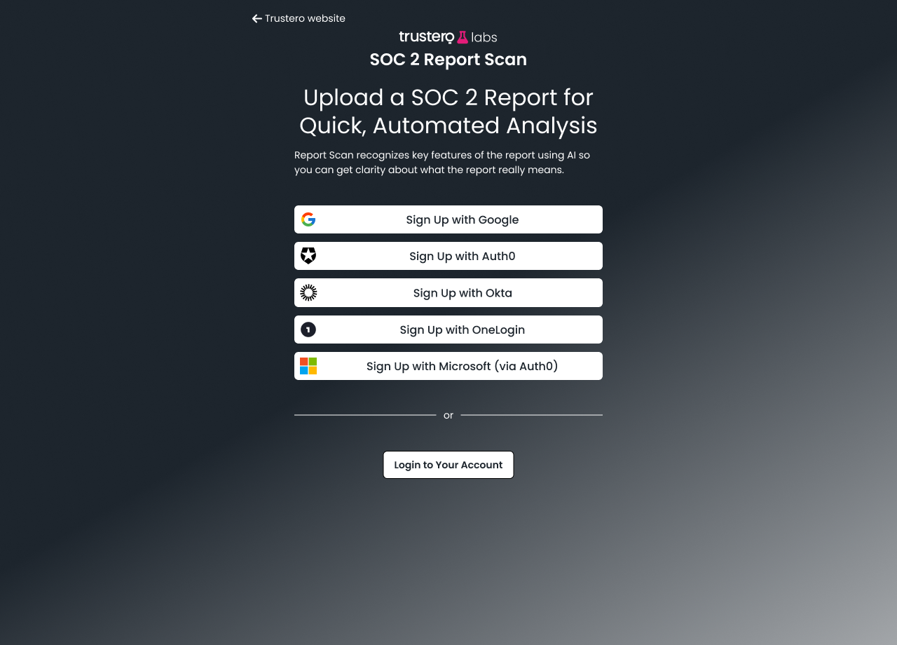
Marketing campaign drives users here.
Open ID validates new signup is real. For trusted identities, we provision the account in one click.
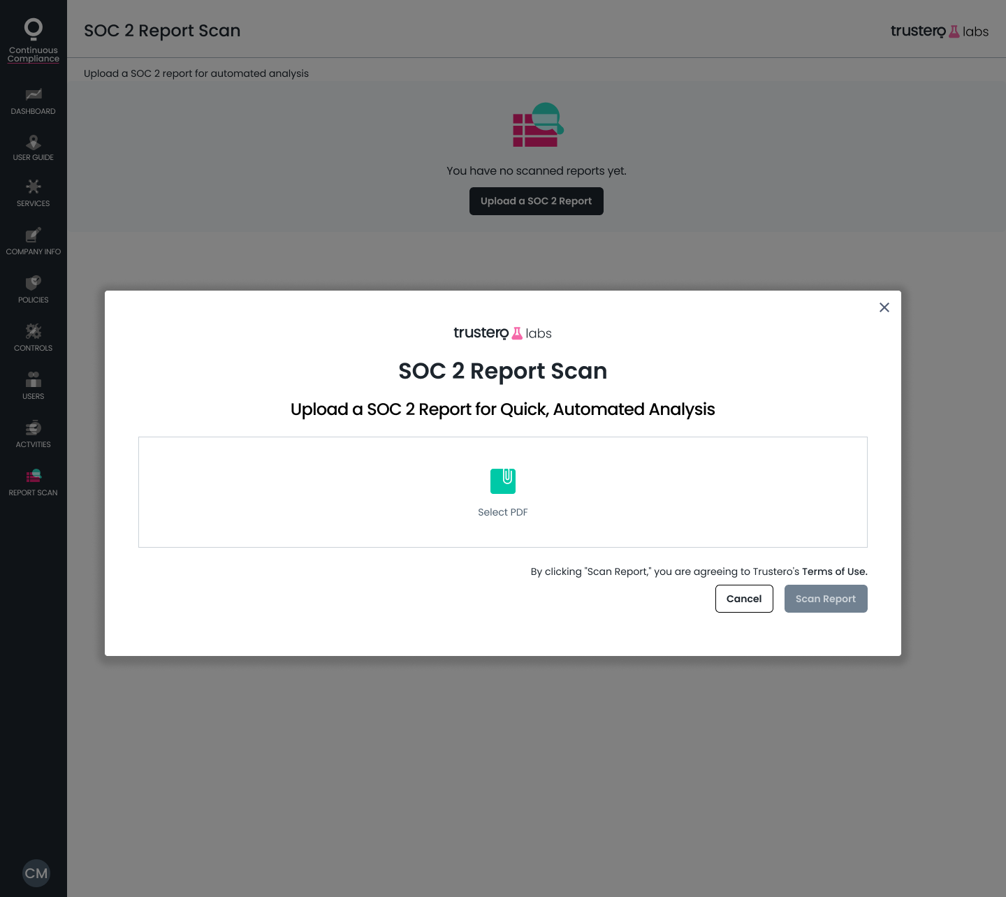
To accelerate the project, we reused components from the design system I already had going. Here we get a colorized PDF icon variant and some legal clickwrap.
A question for you: why not take the PDF as the first step?
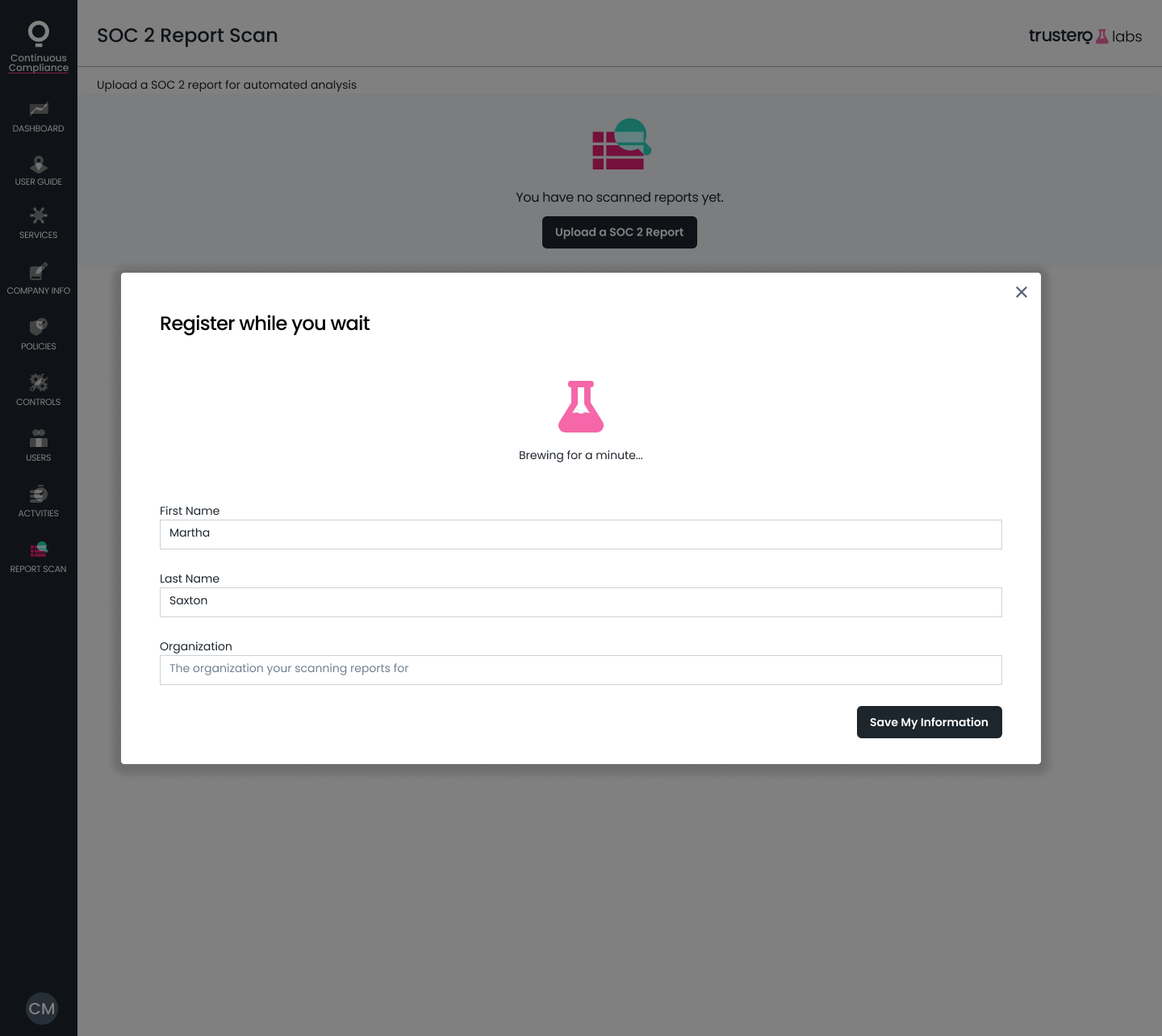
I designed this "brewing" animation as a gif, but we soon discovered our GPT calls would take more like a minute than a second.

Progress states for AI is new territory for me! Here, we used the wait to get customer information. In this mockup, we've plucked the first and last name from the OIDC; this was a suggestion from the implementing dev who noticed this should be doable.
I love working with devs to find what is easy and take advantage of it.
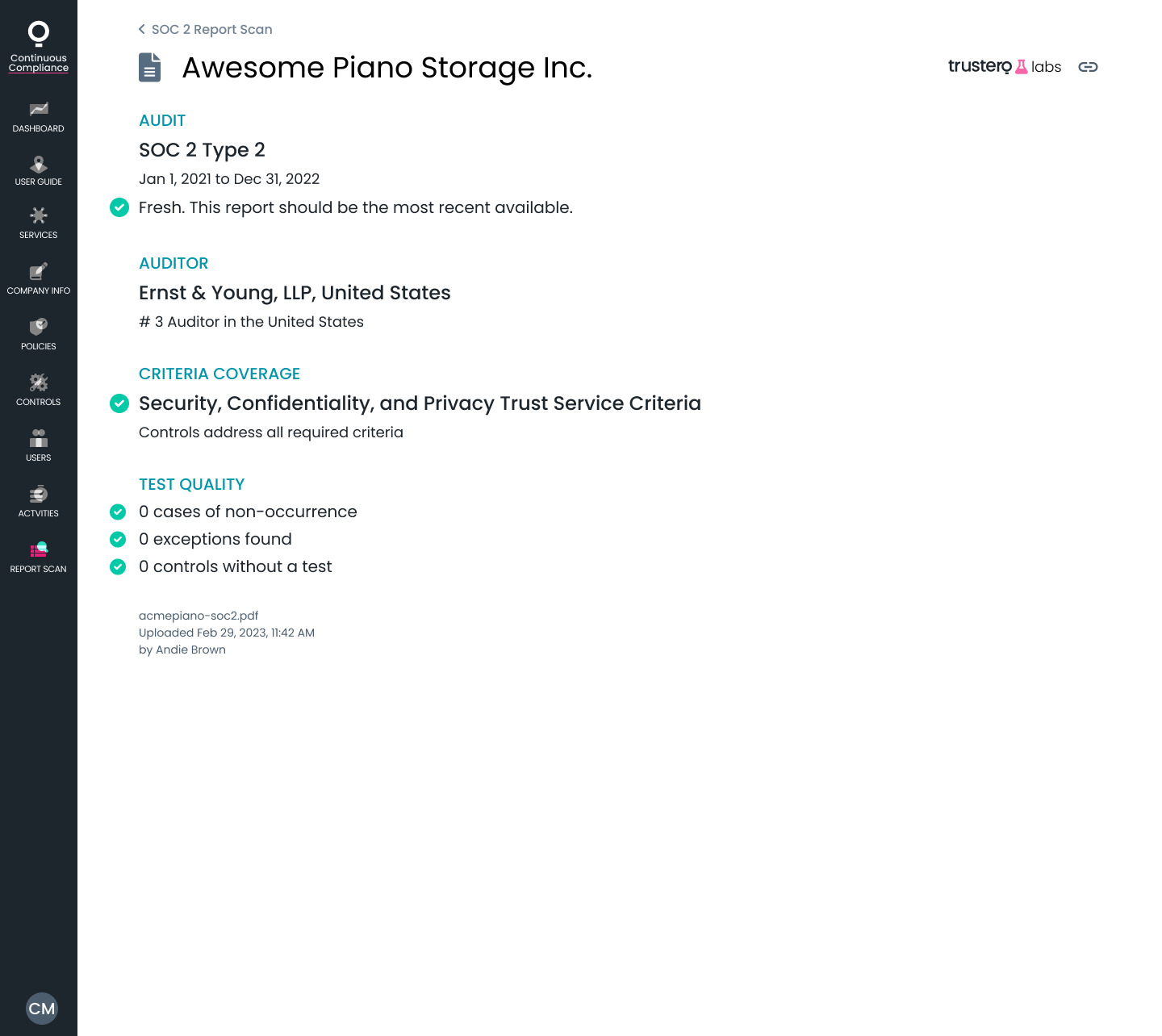
Scan result pages like this are close to the print design work I do recreationally! We need to create a visual hierarchy of information, we use color to flag aberrations, and package it all up to make the user feel nice about whatever result they get.
What do you think was the biggest risk in the results we displayed?
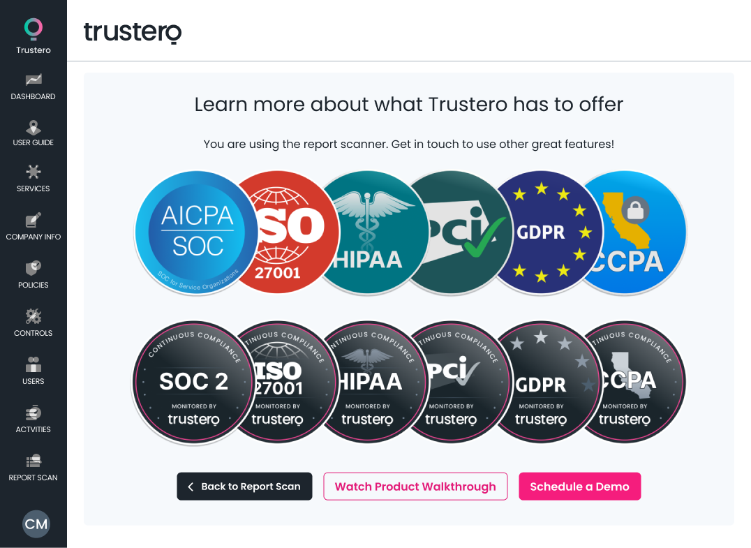
We wanted to hint that there's more to the app than just this scanner, so we kept the leftnav. For this MVP, most links on the leftnav point to this same marketing page. I designed this marketing page, the badges and layout, as well as the linked Product Walkthrough (heard of Walnut?). I did quite a bit of marketing design at this role because the business's primary need was customer acquisition, rather than improved experience for retention or upsell.
A good project that picked up users fast and clearly has a future!